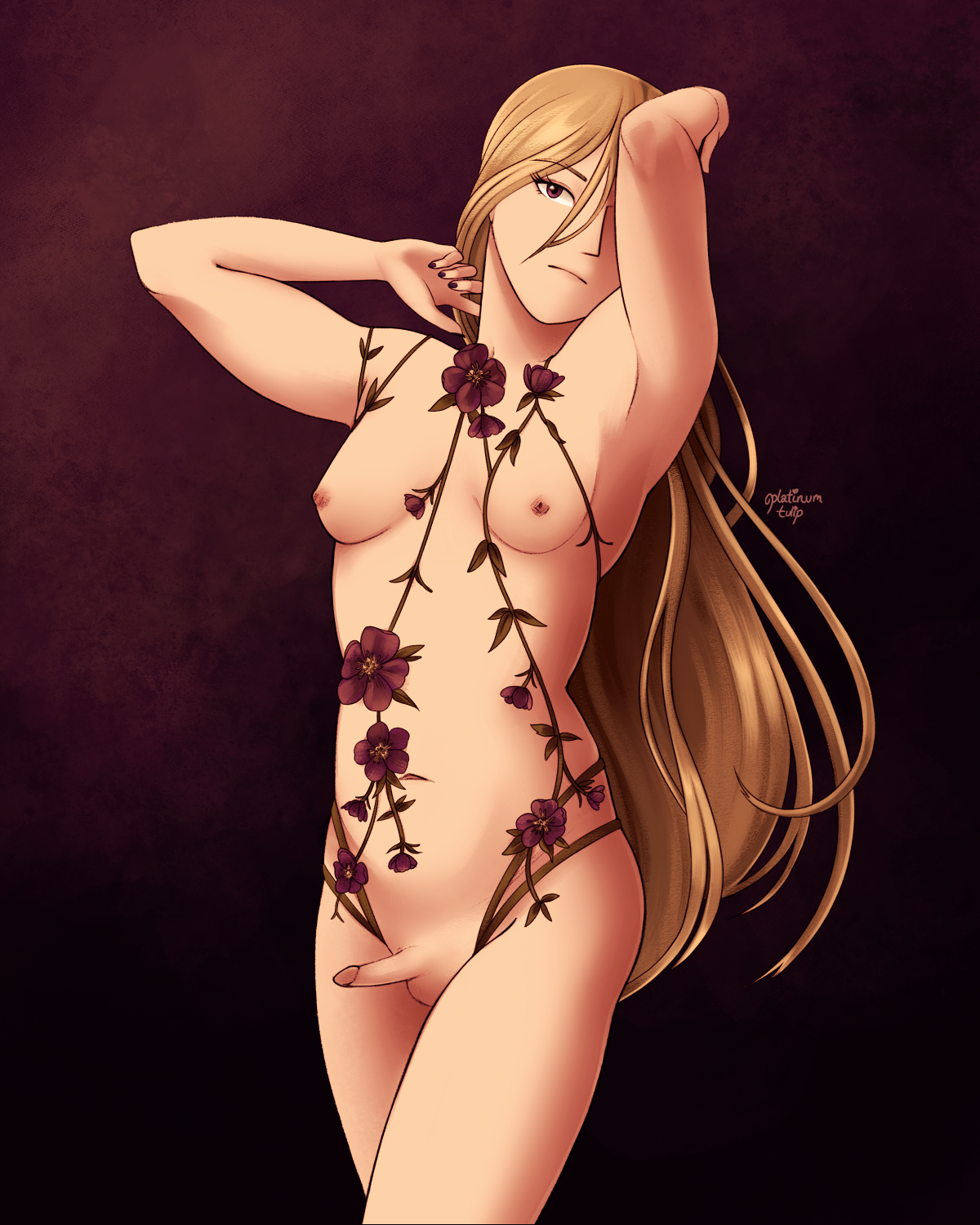
hellebore boudoir process writeup
(originally posted to Patreon on Aug 9 2021)
it's time for another process writeup post! wahoo~!

mostly i wanted an excuse to draw another Lovechild Boudoir bodycage... they're really inspiring to me, just in terms of design and vibes. i love the combinations of straps and floral embroidery combining in such a way that looks like your body is adorned with flowers... i think it's nice!
anyway i have like, uh, a million of them saved.
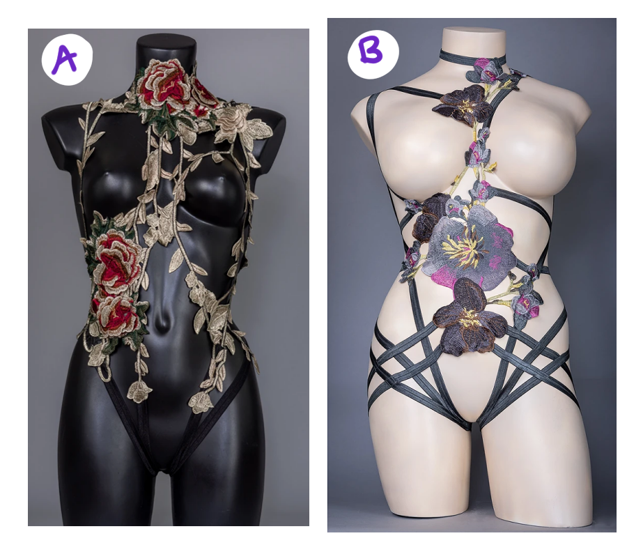
it's hard narrowing down which one i wanted to draw, though. which is why i held that poll on here a few weeks ago.

i was severely torn between the Byzantium bodycage (A, on the left) and the Dystopia bodycage (B, on the right). i loved both of them for different reasons - the color scheme and flowers on the Dystopia set gave me strong Diana vibes, but i loved the draping vine effect of the Byzantium set. a lot of folks overwhelmingly answered for the Dystopia set, though, and i can't say i blame people! the deep purple flowers fit Diana's usual color scheme a lot better.
but when i started sketching out the lines and figuring out how i'd place the straps, i, uh...
i realized, "oh god, this is not going to look the way i want it to at ALL."
something about all the sharp geometric angles and shapes that were created in the composition really did not vibe with me for this drawing. i think maybe if i had gone with a different pose and redrew the hair to be less curved and swirly looking, it would've looked more cohesive. but it was also the option that overwhelmingly "won" the poll, so i felt backed into a wall. i panicked.
ultimately i ended up just combining elements of both sets, so i could still use the color scheme and flower elements from the Dystopia set, while keeping the draped vines from Byzantium. i hated feeling like i ran a poll only to throw out the results, but... ah... i just went with my gut instinct in the end. hopefully people weren't too disappointed...
now, colors! here's kind of a funny thing about the colors. i'm in a discord server for makeup enthusiasts, and people were talking about a collection by MAC Cosmetics that got leaked. as of when i'm writing this, there's still not really additional info about it... but anyway. i fell in love with the color scheme and packaging design of it, and it really inspired me.
![a photo of the eyeshadow palette in question. the colors are opulent purples and golds, with a bit of earthy green]
the combination of deep purple plum, muted olive green, and rich gold was really appealing to me. plus with the baroque-inspired packaging design...! my gears started turning in my head when people posted these leaked photos. haha
took me a few tries to get the color composition just the way i wanted it to, though. my first pass in MS Paint felt a little too washed out for what i wanted, and the golden frame design didn't really pan out in the end. it felt distracting to me, i figured having deep purple negative space would be more impactful.
my other main references were studying some photos of hellebore flowers (because of course), and i also really liked the pose in this Mucha sketch i found while studying more art nouveau. i did end up just taking pictures of myself to get the hands/arms just right, though... man, i really pulled a muscle doing that, lmao.
that's most of what i have to say about this piece, i think- i was tempted to go more ornate with the background, but honestly, i thought maybe it would be better to just let the lingerie speak for itself. also, sometimes i have to put limits on myself and not get lost trying minute details for eternity, because then i'd never get anything else done. haha!