flight of bats process writeup
(originally posted to Patreon on Sept 27 2021)
heads up that this is gonna be kind of a weird one, i think, because i didn't really save a ton of process shots in the middle. but...!! i'll try my best to explain how i worked on this.
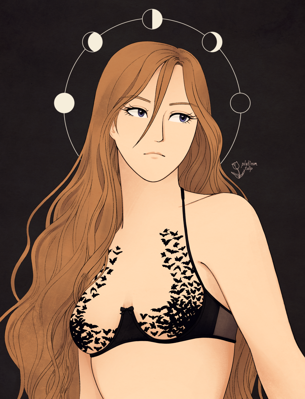
first off, i knew i wanted to keep things... relatively simple. essentially, i wanted the focus to be on the linework and the bats. i also wanted to hold off on doing an elaborate background, because i wanted to exercise some restraint and play with negative space.
i went through a lot of thumbnails.
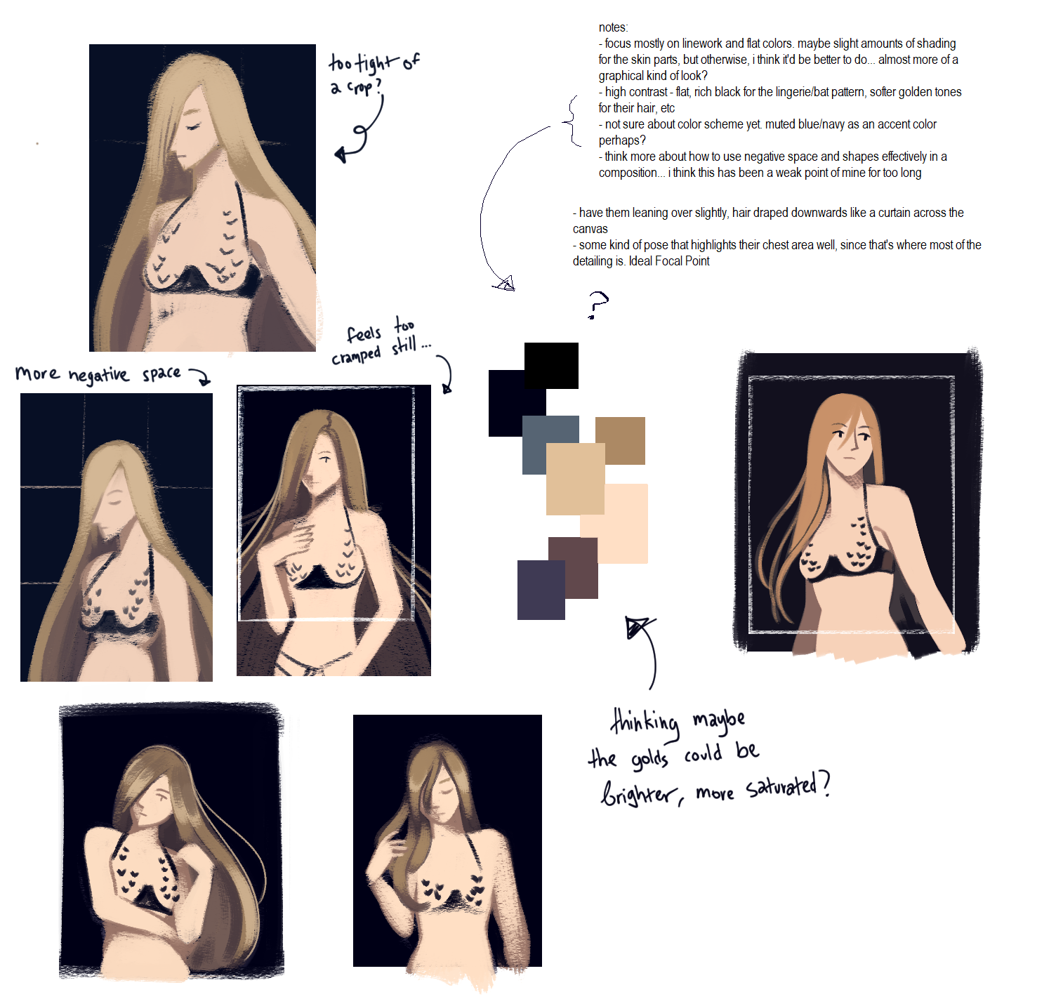
the thing is, i was struggling a lot to find a good pose and composition that made sense - something that didn't feel too stiff, would be at least kind of interesting to look at... basically my thought process was, "i don't really care about it being extremely dynamic, because that's not the point of the piece, but i want it to not look stiff or awkward". i had one pose idea in mind that i really wanted to make work, which involved Diana leaning over, with their hair draped across the canvas like a waterfall. but... god, i just couldn't figure out a way to make it work, and it was driving me absolutely mad.
so i had to let that idea go because otherwise i was just throwing myself at a wall over and over. sometimes that happens and it sucks. i ended up going with the thumbnail on the right there, i just ended up liking that more.
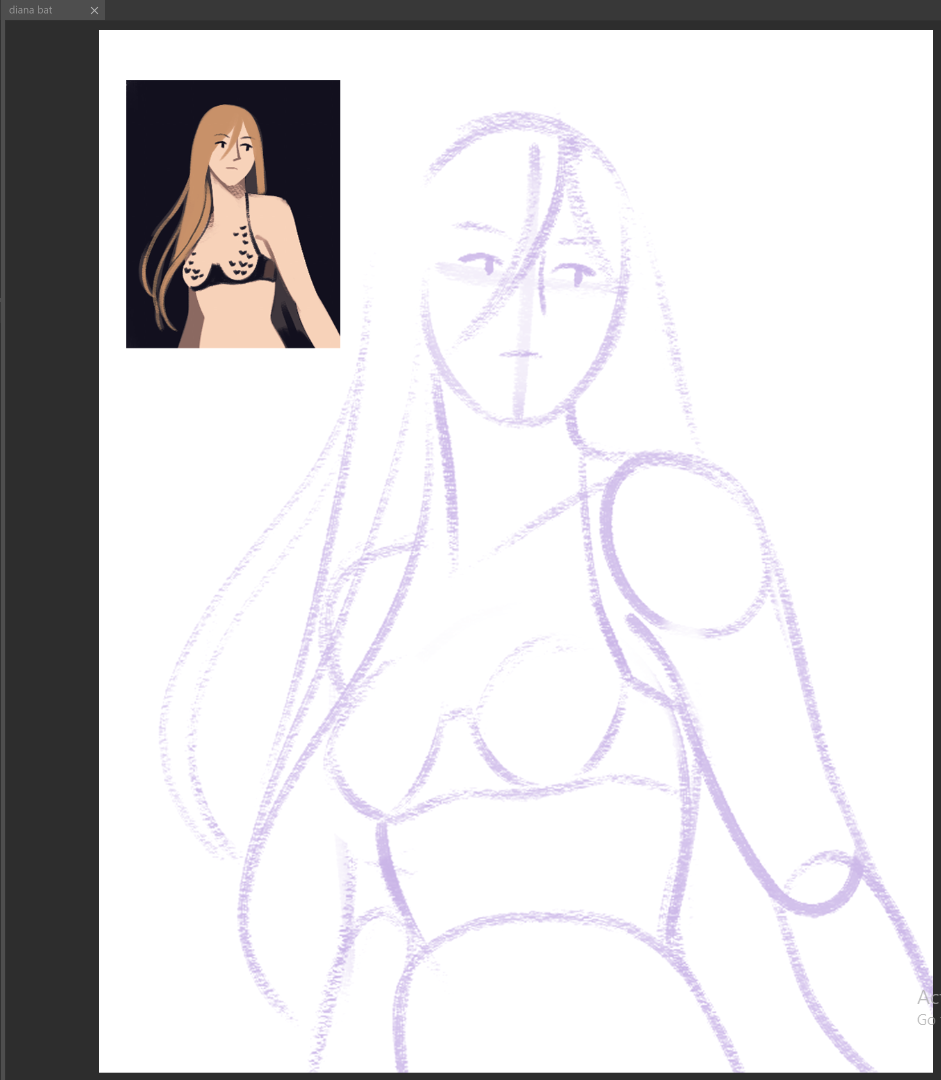
here's what my reference page ended up looking like:
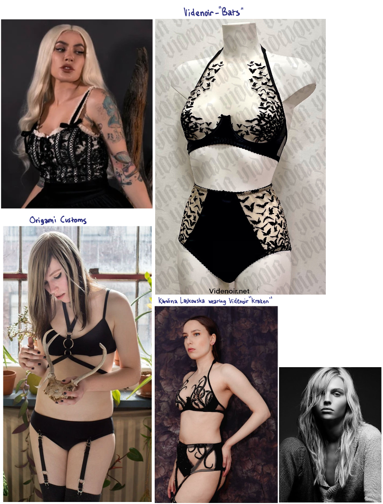
mostly just references for pose, body type, hair, etc. incidentally, Karolina Laskowska's Videnoir review is how i discovered that lingerie designer in the first place. i was really blown away by their designs, and knew i had to draw at least one someday.
i also had another page of references, more for composition/color scheme ideas.
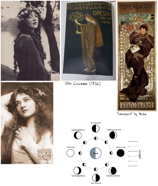
the moon phase idea was actually a last minute idea, because while i was really trying to exercise restraint with the background... something still felt missing, like i needed at least something to balance out the composition.
first sketch... decent start. i usually prefer to sketch with a larger textured brush, just to get the shapes down where i want them.
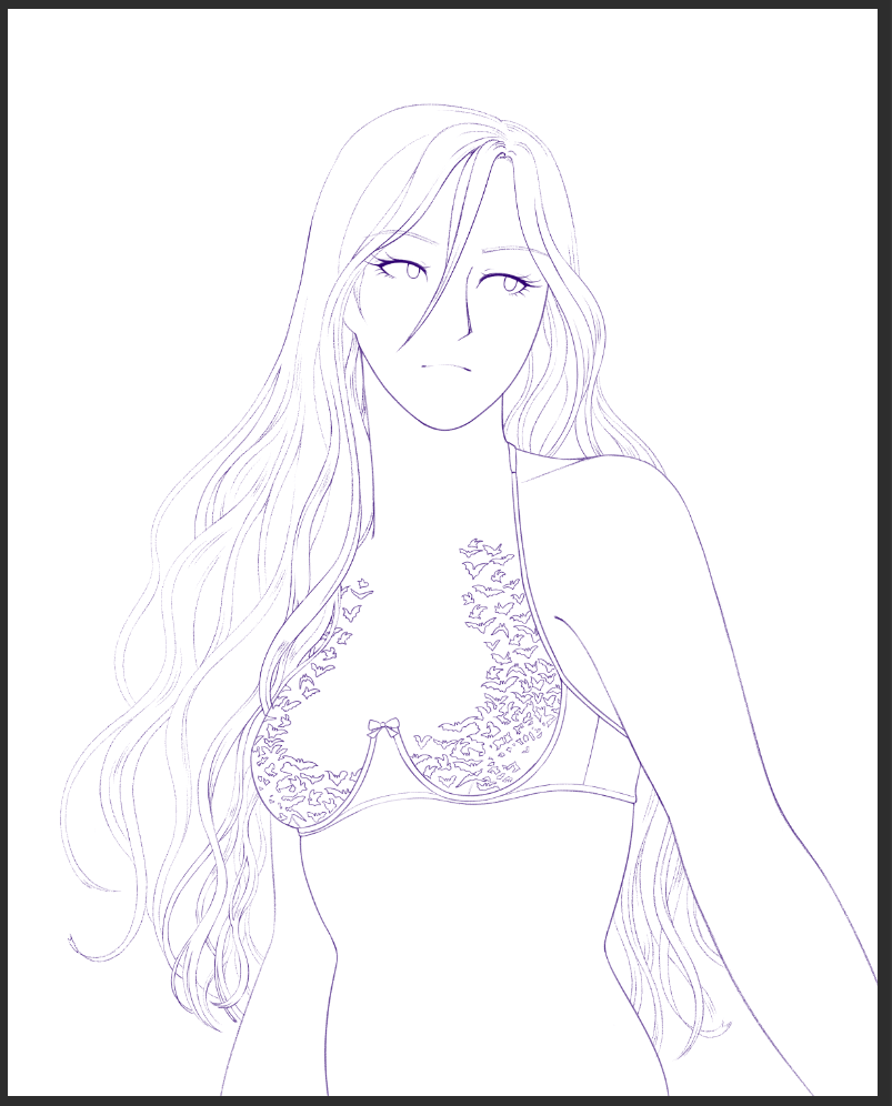
the lines were actually pretty easy to do, actually. i was kind of nervous about getting the bats right, but when i was studying the pattern, i realized that it was mostly the same few silhouettes over and over. i got to zone out and draw hair and bats while watching silly streams and episodes of Deep Space 9 - a pretty good time, imo.
colors, though... that was weirdly finicky. if you look at the thumbnails, i initially thought i'd do something with really cool grey tones, but that was lacking in the kind of contrast i wanted. if i remember right, i did a bunch of color tests where i put down the flat colors for everything, and then did what felt like a thousand gradient maps and level adjustment layers to play with color schemes.
if you don't know what i mean by that, since i feel like no one really explains how they work and i had to figure this out just from playing around for hours, adjustment layers are a feature in some more advanced art programs (photoshop & clip studio, to name two i know of) that let you adjust the colors of an image, but in a layer that you can toggle off, delete, apply masks to, etc. so it's not a permanent change, which is really, really useful.
gradient maps in particular are really cool, because you can completely change the color scheme of an image really easily! here's an example:
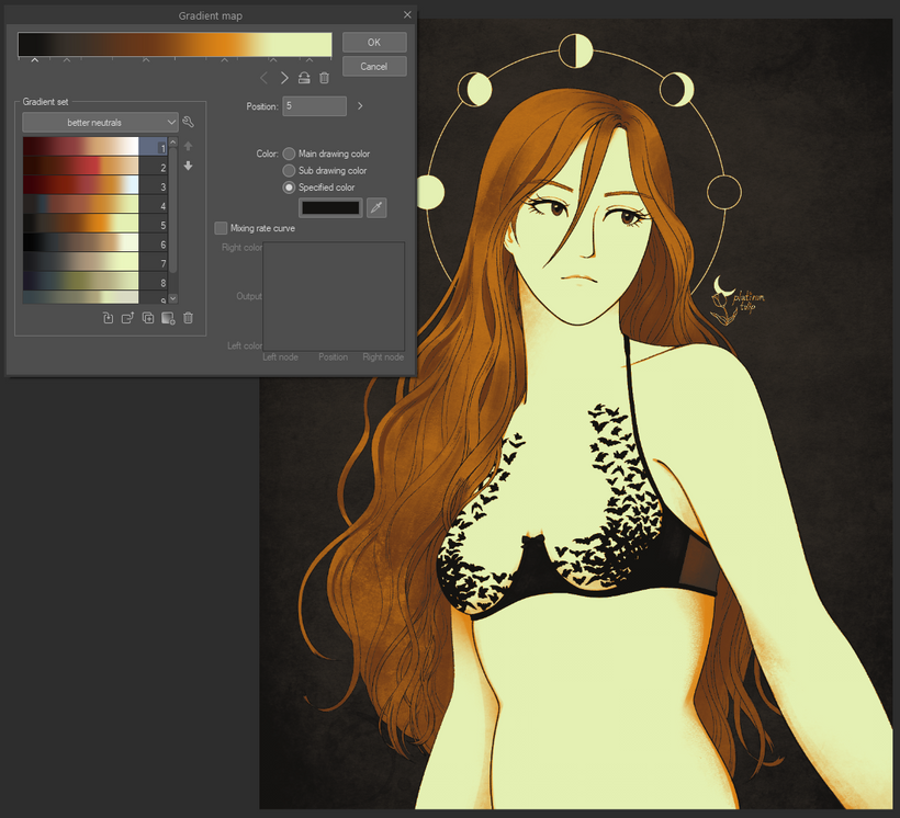
in this screenshot, you can see the colors of the gradient are being applied to my drawing. the darkest tones are the inky black and grey shades, the lightest tones are turned into a pale yellow-green color, and the midtones get turned into deep golden colors. but if i were to select gradient #1 there in the list...
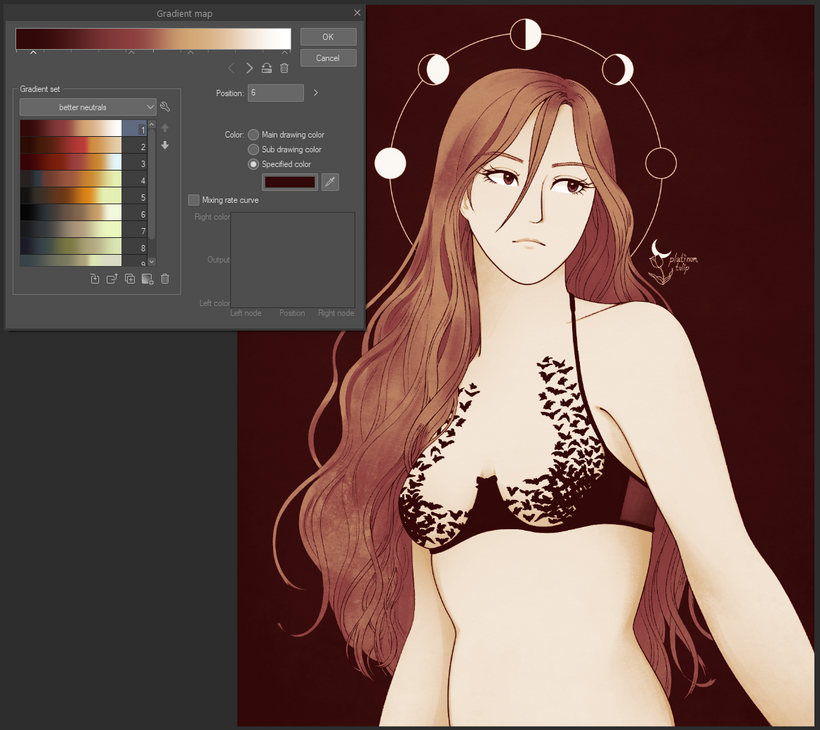
now everything gets turned into deep red shades, since the gradient doesn't really have a true black as its darkest shade. these are pretty extreme gradients, i usually use them as a starting point and then adjust the opacity/layer blending modes to make them a little softer. that way it's more of a tint - closer to how image filters work on instagram or other apps.
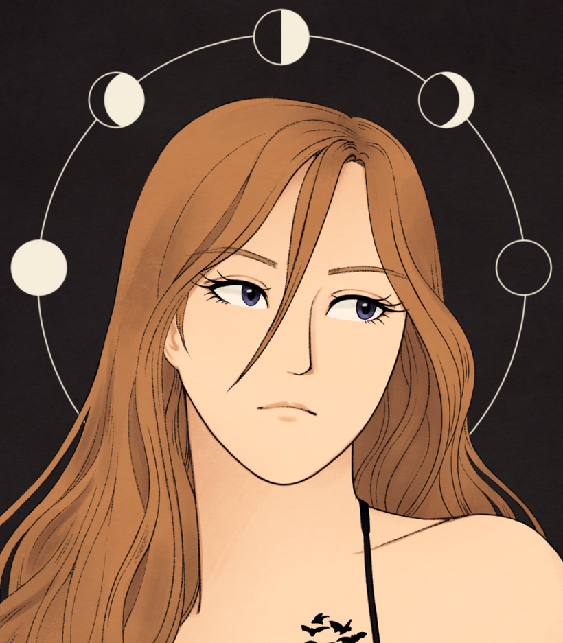
the main thing i wanted to do was increase the contrast more, and go for warmer colors. i thought warmer gold tones would look really pretty with the deep greys and black, so i just played with gradient map settings until i got something close to what i wanted.
to be honest, when i was playing around with layer adjustments, it made me realize i could've pushed the contrast even a bit further in the end... ah well...!!
i also had to really hold back with shading... i feel an instinct to give definition to shapes and forms by painting defined shadows and light, but this time, i really wanted the lines to do more of the talking.
i wanted to softly paint in some shadows, but i wanted them to be pretty subtle. just enough to give you a slight sense of depth.
oh! also, you might notice that a lot of these screenshots show a wider view of the image. that's because i wasn't really happy with how empty the lower third of the original drawing was, i felt like it was throwing the composition off. i decided to crop it tighter at the end, because then you would get a more zoomed in view of the bats, making it a stronger focal point. why didn't i just do that sooner? i... i didn't realize that until it was too late to make more dramatic changes...
anyway, hope you enjoyed me talking about gradient maps at length. really, it feels like such a straightforward piece, but i had to do a lot of careful thinking with this one...