eternal valentine process writeup
(originally posted to Patreon on Feb 28 2022)
so sorry for the delay on this - i probably should have written this all up closer to when i finished it, and then i ended up not having access to any of my files for two weeks... lmao. but i might as well post the notes and WIP shots that i have saved for this piece!
it's been a tradition of mine to draw something for Valentine's Day for several years now. complicated feelings about the day itself aside, it's a good excuse for me to work with themes i really like. pink! flowers! hearts! lace! etc. so i like to take February as an excuse to be self indulgent.
...okay, fine, more self indulgent than usual.
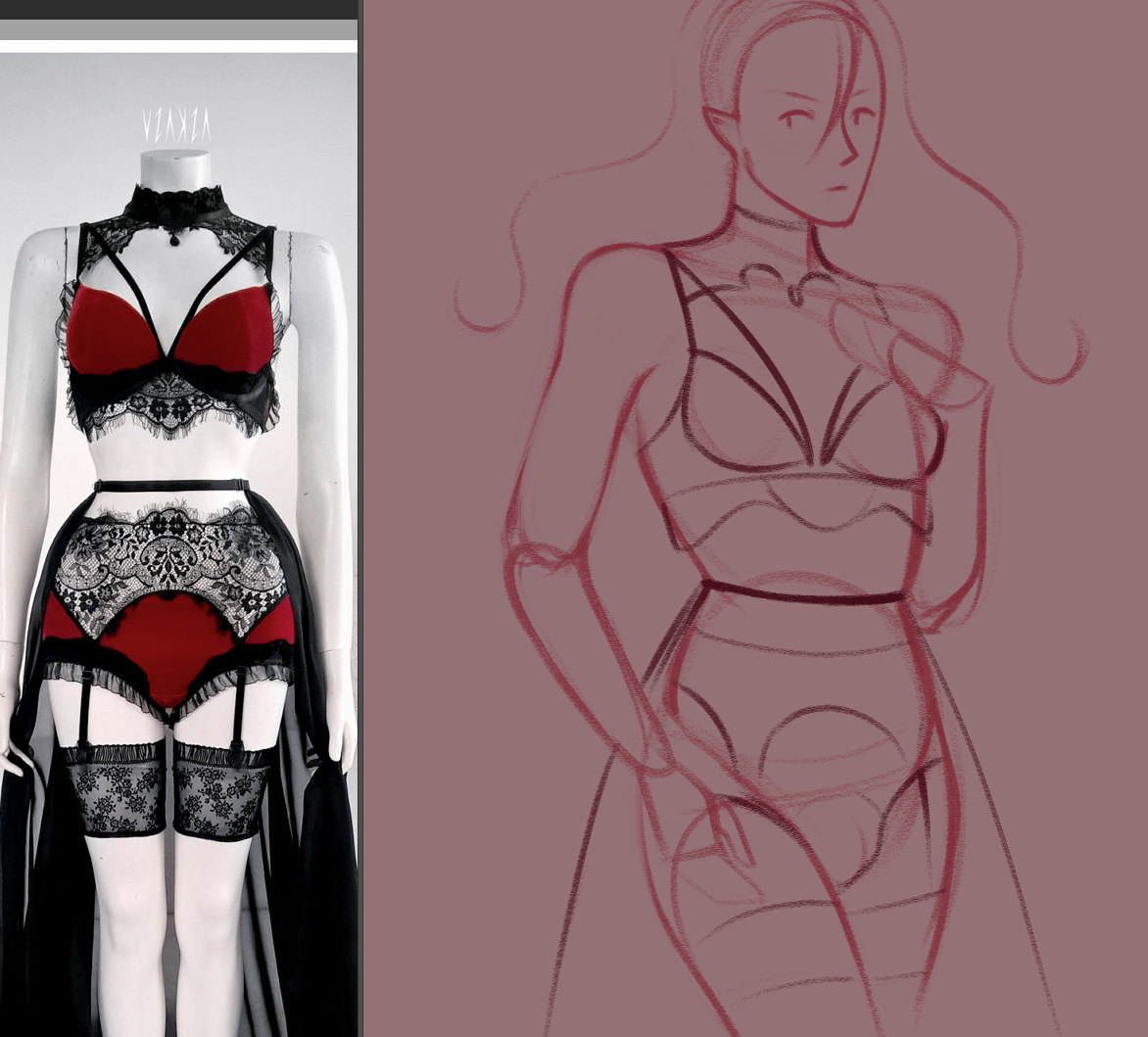
so here's where i started with. i knew 100% that i wanted to draw Askasu lingerie again - according to my notes, that's the Redcurrant Praline lingerie set. i normally don't draw Diana in red, since it's... a little too "obvious" of a choice, i guess, given their vampiric nature. but i thought that rich reds would feel appropriate for Valentine's Day, so i decided to make an exception.
i knew i wanted to work with a pose that felt very elegant, with their hair flowing around. vaguely The Birth of Venus vibes, i guess. and as for colors...! well, i was still struggling a lot with that at the time. i really enjoy looking at eyeshadow palette color schemes, so i picked a few with color schemes that appeal to me. the ones pictured are the Gucci Des Yeux Floral Eyeshadow Palette, Natasha Denona Retro Palette, and a custom palette put together by a makeup youtuber, Hannah Louise Poston. i mostly took inspiration from ND Retro though, which i actually happen to own myself. the reds are so rich! the pinks make my heart sing! i love it.
i did some pose sketches while doing a weekly group drawing session with some folks on Discord. although, uh - i realized quickly that i couldn't actually draw them in their intended garments, because it was a sfw space. lmao! that's fine.
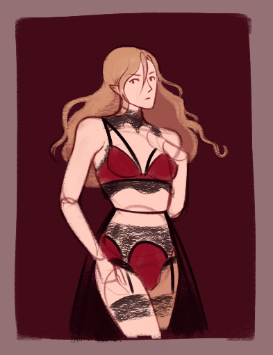
after that, i got to work on a bigger sketch and thumbnail:


i try not to worry too much about precision at this point, just because i'll end up spending way too much time fussing over portions that are subject to change. just need an idea of how i want the shapes and colors to be. blocking out the colors wasn't too hard after that, though. i think i mostly struggled with getting the angle of their bra cups just right - i'm really particular about that kind of thing. it's easier for me to gauge the angles and shape of an unlined bra, since that's what i'm used to wearing and looking at, but this one seemed to be more of a molded contour cup. also probably had some pushup padding, from the looks of it...? i wasn't able to look up a listing for this set, so i tried to estimate as much as i could just from this one image.
i think i got it to a point where i'm mostly happy about how it fits. Diana normally does not get much cleavage, but i thought it'd be a little more realistic in this specific scenario.
anyway!!! onto lace!!!
ahhhhhhh. soothing.
although, i did have some decisions to make about how i wanted to render the lace. it's quite transparent - you can see the white base of the mannequin pretty clearly underneath, for example. but leaving it at the stage in that shot seemed too bare to me.
here you can see that i tried using a rough, textured brush to give that semi-transparent lace net effect, but i wasn't 100% happy with how it was looking:
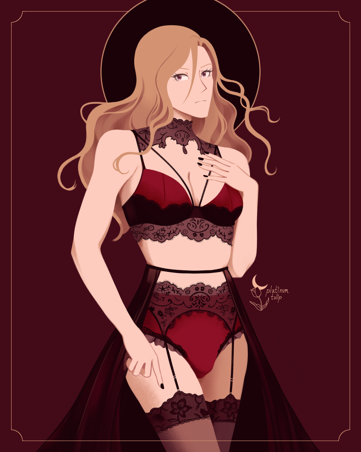
the color choice felt a little grey and dull to me, and i wasn't planning on doing intense rendering on the lighting or anything, so i thought it'd probably be better to recolor it. ended up opting for a muted warm rose kind of shade - a little closer to the tones i was working with for the sheer skirt.
after that, i didn't really want to go overboard with the other aspects of the drawing. in my mind, the main focal point was the lingerie - if i went for a busy background, i think it'd take away from the lace and fabric details. i took inspiration more from art deco, which i associate with more geometric shapes and clean lines.
